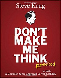
Don’t Make Me Think by Steve Krug
I especially like this book because it is exactly what it claims to be: a relatively short, easy to read book about web usability. In fact, the author explicitly states that he “worked hard to keep this book short – hopefully short enough you can read it on a long plane ride.” Being a very busy person at work and home I really, really appreciate this!
I highly recommend this book for: anyone who is the slightest bit involved in developing or designing a web site’s user interface…period. The reason I say this is because:
- it’s a great starting point for someone who has no experience with web site usability.
- it seems like a great [and quick] refresher for anyone who does have usability experience.
- it’s an interesting read because the author’s character really comes through [versus being dry and boring].
- it really is short enough for a long plane ride or a few nights ‘bedtime reading.’
A few highlights of things I learned and/or appreciated:
- First and foremost, don’t make your users think! For example, descriptions [for categories, products, lists, etc.] should be clear and concise.
- Users really don’t read web pages, they just scan them for keywords.
- Users satisfice when selecting where to go next on any given page. This basically means we tend to choose the first reasonable option instead of examining all of them before selecting one. And yes, I realized that I do this.
- Following conventions is a good thing. Forget about reinventing the wheel and just use techniques and design patterns that people are already comfortable with.
- Keep the visual noise to a minimum [don’t try to cram in everything and the kitchen sink].
- Omit needless words. Get rid of half of the words on every single page. When you’re done with that…do it again. It may sound harsh, but it’s true.
- The “You Are Here” theory. Make it blatantly obvious where you are in the site structure at all times [using page titles, highlighting, home link, tabs, etc.].
- Always have a search box…unless your site is a single static .htm page.
- Keep the home page simple! Remember, it’s purpose is simply to get across the big picture.
- Usability testing doesn’t have to be hard, in fact, it can be down right simple. Just grab your neighbor for 15 minutes.
- Usability tests…small scope frequent testing is better than a single (or few) large scope test(s).
- “The Reservoir of Goodwill” – Don’t use it all up and try to refill it when you do use some!
- Last, but certainly not least. Always keep accessibility in mind when designing. Steve is referring to Section 508 of the 1988 Amendments to the Rehabilitation Act, which specifies accessibility standards for information technology (like web sites).
Check out Steve’s website, sensible.com, for more information about him and his book(s).
